Component Name: RadioButton
States: Checked and Not-Checked
Description
Typically, a series of small round "hollow" circles beside a
series of selections. Only one of the series or set can be pressed or selected
at any given time. Selecting one, or "checking" one means that the
others in the series can not be active at the same time. When one is checked, a
small dark dot appears in the one checked to let the computer user know which
one is "active". It is one selection or another. RadioButtons can
appear in dialog boxes or as menu item choices. Traditionally navigating to a
RadioButton means activation by default.
As with general buttons, RadioButtons can be Text RadioButtons, Image
RadioButtons or Image and Text RadioButtons. Below are examples of each. In the
cse of the Text RadioButtons, the small black dot is in the "One" of
One, Two or Three. Only one of the Image RadioButtons is waving it's hand, and
only the "left" RadioButton indicating "left" is a different
colour than the other two.

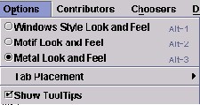
Below is an example from the Swing Set of RadioButtons as a RadioButton
MenuItem
Sound Rationale
The temporary sound for RadioButtons is an electronic three tone sound with
the first tone being raised, the second at a lower pitch and the third raised
again. This is for the "checked state of a RadioButton. For the "not-checked"
state, the tones are reversed, the starting tone is the same as the ending tone,
but the middle tone is raised to give the uauditory illusion of taking a check
mark/selection off. This is the third try at finding a tonal solution that is "appealing
and functional" for this component. Depending on the results of user
testing, this sound might be replaced again.
Component Name: RadioButton - Checked
Navigation
- Required navigation sound effect.
navigate.wav
- Optional disabled sound effect.
disabled.wav
- Optional combined component ID and state information sound effect.
rad_but_check.wav
- Required name/title of component as speech. <RadioButton label>
[Alternate: "no label"].
- Optional role as speech. <Radio Button> [Alternate: "unknown
object"].
- Optional state as speech. "checked" [Alternate: "status
unknown"].
Activation
- Required activation sound effect.
rad_but_check.wav
- Required name or label of component, as speech. <RadioButton label>
[Alternate: "no label"].
- Optional role as speech. <RadioButton> [Alternate: "unknown
object"].
- Required new state of component, as speech. "already checked".
[Alternate: "status unknown"].
"Where Am I?"
- Optional disabled sound effect.
disabled.wav
- Optional combined component ID and state information sound effect.
rad_but_check.wav
- Required name/title of component as speech. <RadioButton label>
[Alternate: "no label"].
- Optional role as speech. <Radio Button> [Alternate: "unknown
object"].
- Optional state as speech. "checked" [Alternate: "status
unknown"].
Additional Information (Control + shift + E)
- Hot Key – (if available) [Alternate: "no Hot Key available"]
.
- Shortcut Keys – (if available) [Alternate: "no Shortcut Key
available"] .
Component Name: RadioButton - Not-Checked
Navigation
- Required navigation sound effect.
navigate.wav
- Optional disabled sound effect.
disabled.wav
- Optional combined component ID and state information sound effect.
rad_but_notcheck.wav
- Required name/title of component as speech. <RadioButton label>
[Alternate: "no label"].
- Optional role as speech. <Radio Button> [Alternate: "unknown
object"].
- Optional state as speech. "not checked" [Alternate: "status
unknown"].
Activation
- Required activation sound effect.
rad_but_check.wav
- Required name or label of component, as speech. <RadioButton label>
[Alternate: "no label"].
- Optional role as speech. <RadioButton> [Alternate: "unknown
object"].
- Required new state of component, as speech. "checked".
[Alternate: "status unknown"].
"Where Am I?"
- Optional disabled sound effect.
disabled.wav
- Optional combined component ID and state information sound effect.
rad_but_notcheck.wav
- Required name/title of component as speech. <RadioButton label>
[Alternate: "no label"].
- Optional role as speech. <Radio Button> [Alternate: "unknown
object"].
- Optional state as speech. "not checked" [Alternate: "status
unknown"].
Additional Information (Control + shift + E)
- Hot Key – (if available) [Alternate: see below*]
.
- Shortcut Keys – (if available) [Alternate: see below*] .
*If there is neither a hot key nor a shortcut
key, the general error is sounded.
Other RadioButton Options to Consider
Within the Swing Set Menu examples is a "List of Contributors"
which is a list of names, beside which are colour coded "RadioButton"
like components. At this point it is not clear whether they are in fact
RadioButtons with colour "qualifiers" or how they might be set up. The
example from the Swing Set is shown below.
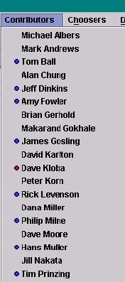
Table of Contents
End of file
Last
updated 11/02/98 by Karen
McCall