Description
A component that allows the user to select one or more objects. A typical example is a list of files in a file chooser dialogue. The contents of a list can be anything. Frequently, it is text, but need not be. It could be a list of icons. For that matter, it could be a mixture of text and icons.
If the list is large, users can navigate it using a scroll bar.
A feature of lists is their selection model. In some instances, a maximum of one item can be selected. This would be true for a file chooser dialogue. Other lists have a multiple selection model, wherein a subset of the list can be selected at once. An example of this is if the list represented food items available for purchase, and the user was selecting a group of items. Note that in this scenario, the selection of an item is distinct from, say, activating the item. The latter is accomplished by pressing the button labelled "purchase" after completing the selections.
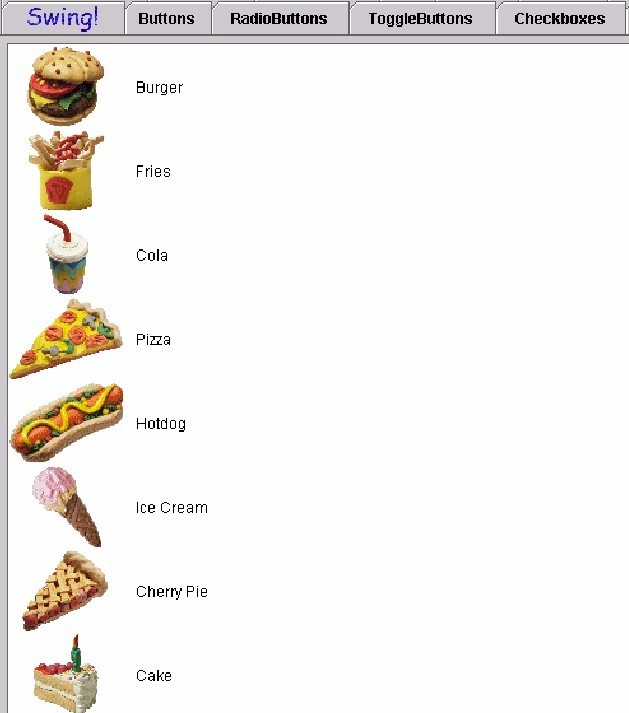
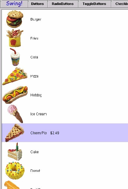
Any list of items which allows the compuer user selection. Examples are font styles, document styles, colours (in older applications), filenames and options/preferences. Illustrated below is a "cutting edge" example of how a list might be represented in an inventory or retail environment. there is a list of items from a restaurant menu, pictures of them on the left, description to the immediate right of the picture and the remainder of the "list area" is blank, that is until you make a selection (second figure) when the price pops into view. This is a great challenge for sonification and an application which is just around the corner.
Figure 2: List selection made (Cherry Pie $2.49)
Sound Rationale
The sound for a list is that of a harp rapidly going up in scales. This sound will most likely change if we have time to develop it in a similar manner to that of a slider. The functions of the two components are similar in that a list can be navigated/activated either up or down, with the user choosing elements along the way.
Navigation
"Where Am I?"
Note: the audio look and feel maintains its own notion of the current item, which the user can alter by using the list navigation keys.
Additional Information (Control + Shift + E)
The additional information for a list is the selection set.
"Where Am I?"
Note: this feedback is the same as for the list itself (see above).
First Letter Navigation
First letter navigation is implemented for lists/list items. In this case, the search is confined to the list items. When the list has focus, pressing a key will invoke the search system. If an item is found, the feedback is the same as if the user navigated to the item via the navigation keys -- see Navigation above. Furthermore, the audio look and feel's notion of "current item" is updated to that item. Note that this can alter the selection set depending on how the primary look and feel responds to moving about the list items. Finally, if no item matches the search, nothing in the list is altered, and the generic error sound is played.
The audio look and feel allows users to add and remove list items from the selection set using only key strokes. This functionality depends on the audio look and feel's internal tracking of the "current list item". As noted elsewhere in this document, this tracking is done independent of the primary look and feel.
As users make key strokes to move item-by-item among the list items, they can at any time add or remove the current item to the selection set, using the add/remove key strokes. The feed back sequence is as follows:
Activation
List Change Report
(NOTE: the above has not been implemented).
Table of Contents
End of file
Last
updated 11/16/98