
This document describes the current set of dialog boxes available via the option pane Swing component. The last kind, "Component" is the most general, and is applied in cases where the type of dialogue is otherwise indeterminate. As such, the "Component" category is the default, and will handle new kinds of dialogues developed in the future.
There are two things to consider with respect to navigation. First, when the dialogue is presented initially, the audio look and feel uses the "navigation to" system to auditorily present the dialogue to the user. This is documented herein. Once the dialogue is "on screen", as users navigate within the dialog, they hear the sounds/speech specific to the component they have navigated to. For example, in a confirmation dialogue, there is a choice of Yes, No or Cancel. Users hear the push button audio feedback as they bring keyboard focus to that button.
There is no separate activation feedback sequence for dialogue boxes, as there is for other Swing components. Dialog boxes have two major sub-parts, those being the message, icons, and other components that make up the body of the dialog, and the set of buttons used to confirm or cancel the dialogue. These latter dismiss the dialogue, and are the closest thing to "activating" it, and the feedback sequence is:
When in a dialog box ONLY
(Note: this is not implemented at the time of this writing).
The "where-am-I" feedback sequence for dialogue boxes consists of a description of the dialogue box (its type, the message, and so on), followed by the "where-am-I" seqence appropriate to the component that currently has keyboard focus within the dialgoue.
There is no additional information for dialogue boxes per se. If the component that has focus defines a response for this key stroke, then it will be presented.
Description
This type of dialog box is made of three components: an icon, a text string, and an "OK" button. The icon is typcially a lower case "i" within a circle, meaning "information". The string is the message. All the user can do with this dialog box is read the message and acknowledge it by clicking the "OK" button. In Windows, this is known as a "information dialog box". The closest thing on the Macintosh is its "message alert", containing the icon of a face (profile) speaking something.
Illustrated below is the Swing Set Dialog using the Java look and feel. The title reads "Message" and the message is "You chose file: <filename>".
Sound Rationale
The sound for a Message Dialog Box is an electronic one, similar to that of a "beeper" or clock alarm. It is meant to "notify" the computer user that there is some information that needs to be read. The information is not to be taken as an error or warning, just some additional information, usually related to the status of a task.
Navigation
Activation: (see above)
"Where Am I?"
Description
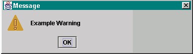
A warning dialogue is used to notify the user when something more serious has occurred as compared to the message dialogue. Although it is more serious, it still is not fatal. The icon is typically a yellow triangle with an exclamation point inside. In the example below the Swing Set Warning Dialog gives the title "Message" and the text "Example Warning" with an OK button to acknowledge the warning.
Sound Rationale
As this is something that requires attention, the sound chosen is that of an air horn; short, to the point and definitely an attention getter!
Navigation
Activation (see above)
"Where Am I?"
Description
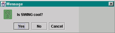
A dialog box which will let the computer user know that a task is complete or ask for confirmation before doing an action. The example below is from the Swing Set, with the "Message" title, and asks the question "Is Swing cool?" to which the computer user can choose, Yes, No or Cancel.
Sound Rationale
A light sparkle sound, just confirming that something has been done or is about to be. The sound is not intense or loud, it is meant as a reminder, not a warning.
Navigation
Activation (see above)
"Where Am I?"
Description
This type of dialogue is asking the user enter for some text before proceeding. The contents of the dialogue are a question mark, a message, a text entry field, and two buttons, namely, "ok" and "cancel". The message is a prompt; for example, "enter your password:". The user provides the answer to the question by typing it in the text entry field.
Shown Below is an Input Dialog used by Netscape to access a "restricted" web page. The title is "username and Password Required" so the computer user knows from verbal feed back what is required. Instructions are given to the computer user and then there are two fields, one for "username" and one for the "password" of the user. The computer user also has the choice of OK or Cancel buttons.

Sound Rationale
The sound used in this case might in fact be overkill. It is the same sound used for Text Area, Text Pane, Edit Pane and the Input Field - the sound of a pencil scratching over paper. Although the sound is appropriate for the function, user testing might show that a sound differentiating the dialog function from the editing functions might be better suited for this component.
The Text Field has the same sound, that of a pencil scratching over a piece of paper. The Password Field has a dual function. It must represent the characters using asterisks so that privacy is protected and in collaboration with this, the sound of computer keyboard keys clicking accompanies each keystroke. Perhaps this sound would be useful for the Input Dialog itself, it would keep the function associated with the sound, and cue the computer user that this is a dialog into which you have input/password fields.
Navigation
Activation (see above)
"Where Am I?"
Description
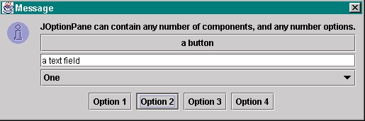
This dialog box is the most general of all the option panes. It can contain an icon, plus any number of other components, plus any number of dismisser buttons. Typically such buttons are "ok" and "cancel", but there may be more. The other components can be check boxes, menus, radio button groups, text entry fields, or even other push buttons. However, these latter push buttons do not close the dialog box; only the dismissers do. The purpose of this dialog box is to allow developers to build more complicated dialog boxes when the others, described above, simply will not suffice. Below is the Swing Set example of a Component Dialog. It contains lists and buttons which provide options for the computer user.
Sound Rationale
The sound chosen for this is a difficult one. How does one convey a number of different things all tumbling into the "present combination" of selections? The sound representing a "combo" box is a series of different individual sounds, all tumbling together much the way game pieces and dice tumble out of that hollow container provided dice shaking! It can also be interpreted as a number of elements all tumbling together and your imagination can predict what will happen when they meet!
Navigation
Activation (see above)
"Where Am I?"
Table of Contents
End of file
Last
updated 11/25/98