Component Name: CheckBox
States: Checked and Not-Checked
Description
A component that is typically displayed as a box that can be "checked"
or "not-checked". A CheckBox MenuItem is a combination of a menu item
with a check box. Traditionally one of the main differneces in application of
CheckBoxes vs. RadioButtons is that 1) you can navigate to a CheckBox without
activating it and 2) more than one CheckBox in a series can be activated at a
time. To "not-check" a CheckBox, a computer user has to perform that
function.
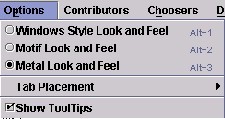
Below is an example of a CheckBox MenuItem. Visually a small hollow box
appears to the left of the text description/function. In this case it is "Show
ToolTips" which is checked in the Options Menu.
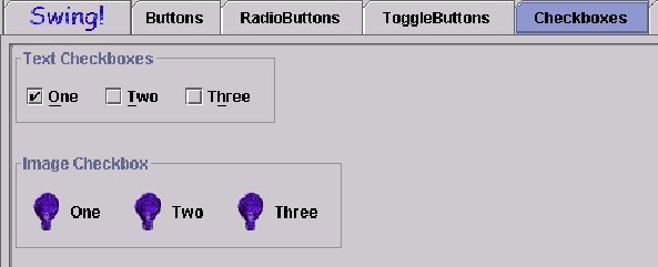
Illustrated below, are various ways the current Swing Set depicts
CheckBoxes. There are "familiar" items such as Text CheckBoxes and
Image CheckBoxes, but in each case, more than one item is selected or "ehecked"
and there are items which reamin "not-checked" in each series.
Component Name: CheckBox - Checked
Navigation
- Required navigation sound effect.
navigate.wav
- Optional disabled sound effect.
disabled.wav
- Optional combined component ID and state information sound effect.
checkbox_check.wav
- Required name/title of component as speech.<checkbox label>
[Alternate: "no label"].
- Optional role as speech. <CheckBox> [Alternate: "unknown
object"].
- Optional state as speech. "checked" [Alternate: "status
unknown"].
Activation
- Required activation sound effect.
checkbox_notchk.wav
- Required name/title of component as speech.<checkbox label>
[Alternate: "no label"].
- Optional role as speech. <CheckBox> [Alternate: "unknown
object"].
- Required new state of component, as speech. "not checked"
[Alternate: "status unknown"].
"Where Am I?"
- Optional disabled sound effect.
disabled.wav
- Optional combined component ID and state information sound effect.
checkbox_check.wav
- Required name/title of component as speech.<checkbox label>
[Alternate: "no label"].
- Optional role as speech. <CheckBox> [Alternate: "unknown
object"].
- Optional state as speech. "checked" [Alternate: "status
unknown"].
Additional Information (Control + shift + E)
- Hot Key – (if available) [Alternate: "no Hot Key available"]
.
- Shortcut Keys – (if available) [Alternate: "no Shortcut Key
available"] .
Component Name: CheckBox - Not Checked
Navigation
- Required navigation sound effect.
navigate.wav
- Optional disabled sound effect.
disabled.wav
- Optional combined component ID and state information sound effect.
checkbox_notchk.wav
- Required name/title of component as speech.<checkbox label>
[Alternate: "no label"].
- Optional role as speech. <CheckBox> [Alternate: "unknown
object"].
- Optional state as speech. "not checked" [Alternate: "status
unknown"].
Activation
- Required activation sound effect.
checkbox_check.wav
- Required name/title of component as speech.<checkbox label>
[Alternate: "no label"].
- Optional role as speech. <CheckBox> [Alternate: "unknown
object"].
- Required new state of component, as speech. "checked"
[Alternate: "status unknown"].
"Where Am I?"
- Optional disabled sound effect.
disabled.wav
- Optional combined component ID and state information sound effect.
checkbox_notchk.wav
- Required name/title of component as speech.<checkbox label>
[Alternate: "no label"].
- Optional role as speech. <CheckBox> [Alternate: "unknown
object"].
- Optional state as speech. "not checked" [Alternate: "status
unknown"].
Additional Information (Control + shift + E)
- Hot Key – (if available) [Alternate: see below*]
.
- Shortcut Keys – (if available) [Alternate: see below*] .
*If there is neither a hot key nor a shortcut
key, the general error is sounded.
Table of Contents
End of file
Last
updated 11/02/98 by Karen
McCall