Description
As illustrated in the Swing Set model, a combination of a text field and drop-down list that lets users either type in a value or select it from a list that is displayed when the user asks for it. It is really two components: a menu or list of choices, and a text field.
The list can appear either as a menu, or a list. If it appears as a menu, all the items are visible at once. If it appears as a list, and the items do not fit, then it will look like a scrollable list.
With respect to the text field, the combo box can be one of two types, namely, editable or non-editable. Editable means that users can bring focus to the text field and start typing, deleting, or otherwise altering its contents. This can mean that the users can add new contents to the list. A user for this would be in a find dialogue box where the list contains strings previously looked for, but users can always type in a new search string. For combo boxes that are not editable, users can only choose what is on the list.
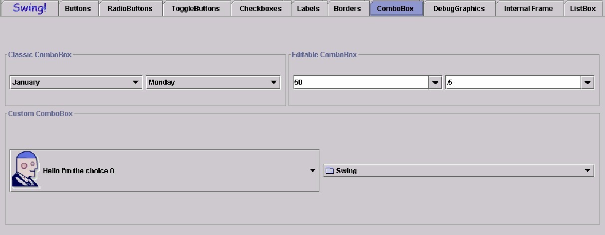
Illustrated below is a Swing Set ComboBox. It shows a "classic bombobox" which has lists activated by pressing an arrow on the right hand side of the "list button/drop down box"; and a "custom bombobox" which has a larger "list button/drop down box" which has a picture, description of th echoice and an arrow to show the rest of the list (eight hand side of "list button/deop down box").
Sound Rationale
The sound chosen for this is a difficult one. How does one convey a number of different things all tumbling into the "present combination" of slections? The sound representing a "combo" box is a series of different individual sounds, all tumbling together much the way game piecesand dice tumble out of that hollow container provided dice shaking! It can also be interpreted as a number of elements all tumbling together and your imagination can predict what will happen when they meet!
Navigation
Activation
There are three ways to manipulate a combo box. The simplest is the user navigating among the items represented by the combo box. In that case, the activation report provides feed back as to which item is currently selected:
A second way to manipulate a combo box is available only if it is editable. In this case, the feedback is whatever the editor component is capable of. For example, if the editor is a text field, then its report generator system will be invoked:
Finally, there needs to be a way to move between "edit mode" and "selection mode" if the combo box is indeed editable. If it is not, and the user attempts to make such a mode switch, and error is played -- blipErr.wav.
If the switch can be made, then the navigation-to report is issued as detailed above. (The reason for this that this kind of "activation" results in moving focus among two sub-parts of the combo box).
"Where Am I?"
Additional Information
N/A
Note: A Combo Box can have ANY number of or type of other components from checkboxes to radiobuttons, toggle buttons, internal panes and desktop panes. Shown above is the most typical example of a combo box and the audio look and feel for it.
Table of Contents
End of file
Last updated 09/17/98